Discover the true size of countries, continents, and oceans. Explore how map distortions affect perception, education, and global equity in this deep-dive, expert-written article.
The phrase “the true size of” might seem like just a geographic curiosity at first glance, but dig a little deeper and it opens up a conversation about perception, reality, and how our world is represented. In maps, media, education, and even in our imaginations, the sizes of countries, continents, and even oceans are often distorted. In this article, we’re going to explore what “the true size of” really means, why it matters, and how this concept changes the way we understand our planet.
Understanding Map Projections and Their Distortions
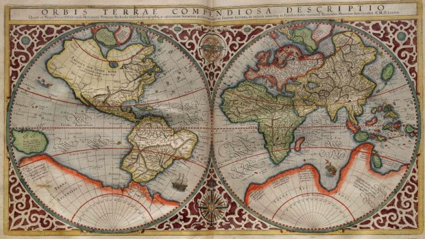
Most of us grew up looking at the world on a flat map. You probably remember the Mercator projection from school—a colorful rectangle where Greenland looks almost as big as Africa. That map might have seemed accurate, but it’s actually one of the biggest culprits in distorting the true size of countries.
Map projections are essentially attempts to take a spherical Earth and flatten it into a two-dimensional surface. This is no easy feat. To make it work, cartographers have to compromise. Some projections preserve shape, others preserve direction or distance, but rarely do any of them preserve size.
The Mercator projection, for example, was developed for navigational purposes, not for accurately representing landmass size. It stretches areas near the poles, making regions like Europe and North America look much bigger than they really are. Africa, which is more than three times the size of Europe, often appears smaller.
This discrepancy in the true size of continents and countries affects more than just geography classes. It shapes our worldview. Larger-looking countries are often perceived as more important, more powerful, or more developed. Understanding the true size of regions can help combat these biases.
The True Size of Continents: Surprising Facts
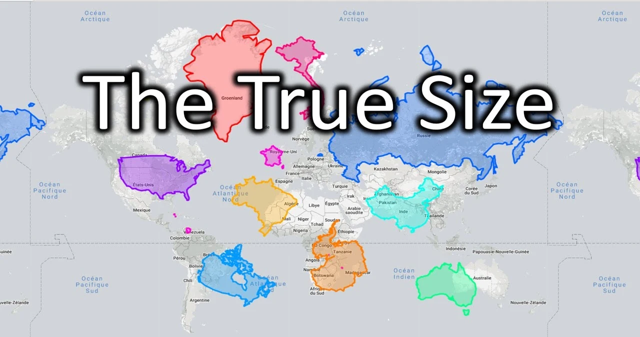
Let’s zoom out and look at entire continents. Africa, for example, is often underestimated. In reality, it’s massive. You can fit the United States, China, India, Japan, and much of Europe inside Africa and still have room left over. That’s the true size of Africa—a continent that defies our common mental images.
Similarly, South America tends to get visually minimized in traditional maps. Brazil alone is larger than the contiguous United States, yet on many maps, it appears much smaller. Australia, too, often looks deceptively small, but it’s nearly the size of the continental US.
Asia is typically the largest continent by landmass and population, and that part is usually represented correctly, though northern regions like Russia get exaggerated in most projections. Understanding the true size of these areas helps us appreciate the scale and diversity they contain.
The True Size of Countries: Rethinking Global Scale
One of the most striking examples of size misperception is Greenland. On the Mercator map, it appears almost the size of Africa. In reality, Africa is about fourteen times larger. Greenland’s true size is closer to Saudi Arabia.
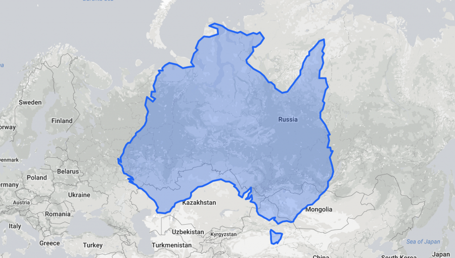
Canada and Russia also benefit from this polar distortion. Both countries appear enormous, and while they are indeed among the largest, their true size is smaller than how they appear on a Mercator projection. Russia, for instance, looks like it covers half the globe, but that’s just visual trickery.
India, Indonesia, and many African nations often look smaller than they actually are. This underrepresentation can lead to a diminished view of their importance or relevance. Recognizing the true size of these countries allows for a more balanced global perspective.
Tools That Reveal the True Size Of

Thanks to the internet, you can now explore the true size of countries yourself. Websites like “The True Size Of” let you drag and drop countries across the map to see how they change when moved closer to or farther from the equator. It’s a fun and eye-opening experience.
These tools are more than just digital toys; they provide a visual correction to years of cartographic distortion. You might discover that Mexico is much larger than it looks, or that Scandinavian countries shrink considerably when placed near the equator.
This hands-on approach to learning helps reinforce the concept that the Earth is not as simple as a flat map. The true size of places is contextual, and interactive maps bring that context to life.
Why the True Size of Matters in Education and Culture
When students learn geography, they often rely on maps that don’t accurately reflect the true size of countries. This leads to skewed perceptions that can last a lifetime. Educational institutions are beginning to adopt more accurate representations, but there’s still a long way to go.
The true size of countries and continents isn’t just academic—it influences cultural and political attitudes. A larger-looking country can be perceived as more dominant or significant, even if its actual landmass or influence doesn’t match the visual.
Representation matters. Just as accurate demographic and economic data shape policies, understanding the true size of regions helps inform global decision-making. It’s about equity, perspective, and truth.
How Perception Influences Policy and Power
Geopolitical decisions often rely on data, but visual perception plays a surprisingly strong role. When a country looks huge on a map, it may be perceived as having more resources, military power, or global influence. That perception can influence policy decisions, funding, and international relations.
Consider how Africa is treated in global discussions about development. Despite its vast size and wealth of resources, it’s often framed as a continent in need rather than one of opportunity. The true size of Africa tells a different story—one of potential, diversity, and growth.
Changing the map changes the narrative. It helps realign discussions toward facts rather than misconceptions. Knowing the true size of places leads to better-informed opinions and more equitable discourse.
The Ocean’s Hidden Size: The Overlooked Majority
We often forget that the oceans cover more than two-thirds of our planet. The Pacific Ocean alone is larger than all the continents combined. Yet on most maps, oceans are shrunk to fit continental views.
The true size of the oceans reminds us of the vastness and importance of maritime ecosystems, trade routes, and climate systems. From ocean currents to rising sea levels, what happens in the water deeply affects life on land.
Recognizing the true size of oceans also highlights how much of the Earth remains unexplored. We know more about the surface of Mars than we do about the ocean floor. That’s an incredible thought, and it changes how we prioritize exploration and research.
Exploring Human-Centric Distortions
Many world maps were designed with a Eurocentric viewpoint, placing Europe at the center and enlarging Western nations. This design wasn’t arbitrary; it reflects a history of colonialism and power.
Understanding the true size of regions helps break down these historical biases. It decentralizes the world map and encourages a more inclusive view of global geography.
It’s important to recognize how visual representations can reinforce existing hierarchies. By shifting toward more accurate depictions, we help reshape mental maps and challenge long-standing assumptions.
Climate Impact and the True Size of Vulnerability
The true size of coastal and island nations becomes especially relevant in the context of climate change. Countries like the Maldives or Tuvalu may appear tiny on maps, but their vulnerability is enormous.
Small doesn’t mean insignificant. Rising sea levels threaten millions of lives, and the true size of this threat is often masked by visual underrepresentation. Visual accuracy can help draw more attention to these pressing issues.
Similarly, the true size of deforestation in regions like the Amazon becomes more alarming when understood to scale. The area affected spans more land than many countries combined, and its impact reaches globally.
The Psychological Effects of Map Misrepresentation
There’s a psychological comfort in maps. They give us a sense of place and order. But when the true size of places is misrepresented, it can subtly shape how we value them. Bigger often feels more important.
This has a real-world impact. Nations that appear large may get more aid, more attention, or more voice in global forums. It’s not fair, and it’s not accurate. Accurate size representation helps balance these inequalities.
The good news? People are starting to notice. Educators, cartographers, and everyday learners are pushing for more truthful visualizations. The true size of isn’t just about geography—it’s about justice.
Popular Culture and the True Size Of

Even pop culture isn’t immune to size distortions. Films, books, and games often use exaggerated maps that reinforce old-world views. The hero’s journey usually begins in a visually dominant country, reinforcing its status.
Reevaluating the true size of places in media helps us tell better, more inclusive stories. It opens the door for narratives from underrepresented regions, bringing new voices into the global conversation.
From superhero blockbusters to travel blogs, creators have a role to play. Using accurate geography helps enrich content and educate audiences.
FAQs
What does “the true size of” mean?
It refers to the actual land area of a country or region, often distorted on traditional maps due to projection methods.
Why do maps distort the size of countries?
Flattening a globe onto a map requires compromises, and many projections, like Mercator, stretch areas near the poles.
Is Africa really as big as people say?
Yes! Africa is enormous—larger than the US, China, India, and most of Europe combined.
Are there tools to explore the true size of countries?
Yes. Websites like “The True Size Of” allow you to compare countries by dragging them on a map.
Why does it matter how big countries look on a map?
Perception influences policy, education, and cultural importance. Accurate representation leads to more informed decisions.
Which map is most accurate?
No map is perfect, but some like the Gall-Peters projection preserve area more accurately than Mercator.
Do oceans get distorted too?
Yes. Oceans often appear smaller on maps, hiding their true size and importance.
Conclusion
Understanding the true size of our world is more than just a cartographic curiosity. It’s a gateway to seeing the planet more clearly and fairly. By challenging our assumptions and embracing more accurate representations, we foster a more informed, equitable global perspective. The world is big—much bigger than many maps have led us to believe. And that matters more than ever.


